Statement Of Intent
The theme of this project, is "Landscapes". It's a very broad aspect but, that's the most amazing part of it because you can go as deep with the photographs as you want, as well as adding in as many details as you want - there's just a lot to take in landscapes. I think the location is very pivotal because the features of the area is what will shine through the photos therefore, going to two contrasting places will illuminate the various aspects.
Throughout this landscape project we will go to urban and rural landscapes. The research will consist of relevant photographers, as well as a short analysis on the photos they have taken and my photos. Within each landscape, I must capture the relevant photos including the weather because we will be going to Anglesey in the winter and Manchester/Salford in the summer.
I hope to go out to capture specific aspects that are required because, if I'm going to the seaside, I want to make sure I have the; sea, sand, rocks and weather as they are something you don't usually see in other places/landscapes. I want to zoom in on things that are very rare to see in Manchester by capturing panoramic views as well as close views - this will help to give an insight in different landscapes, when I come to do that later on. Within each aspect of landscapes that I do, many other things will be needed for instance, if I'm going to the beach, I'll make a section related to the sand, then another section related to the sea and maybe another one for texture or seaweed etc, and if it's the urban areas, I will need to take the roads, construction and a more busier feeling to it. Having these sections, show the exploration of the landscapes, and shows various photographic skills.
I have to first research who my ideal photographers are (for the location I am going to). For example, "David Lindo", is a photographer who has taken photos in Anglesey, specifically in trees. Simon Kitchin is another one but, he has a more broader focus on Anglesey such as sunrise, sunset, seas, lighthouses and, he manages to capture great colour within his photos which just makes everything look much more alluring. However, I think it always helps to have something to branch out and have a look at from time to time so, I will use a mind map to illustrate my ideas. From this, I can quite easily have a central focus in my head, as well as sub focuses that I need to look out for within my location; Anglesey project as well as the Manchester/Salford


I'd love to zoom in on many features in Anglesey, as shown above, zooming in on the grass or a main aspect within a shot. I'm inclined to incorporate as many colours into the shot as possible, as well as thinking about my surroundings, considering that there will be a lot to take and I need to make sure I have everything ticked of the checklist. I'm mostly likely going to be using shutter speed to capture water details - they could potentially be crashing into rocks, moving quite fast, waves coming on to shore etc. I might also use aperture in order to adjust the light - I don't know if it will be to dark or light in certain places. And I'm probably going to experiment a little bit with white balance because, sometimes, you can get some very moody/dramatic photos from it or, very optimistic and clear photos from it.
To develop them further, I'm inclined to use Photoshop because, there's just so much you can do with it - it just enhances a photo drastically, as long as it's used carefully and appropriately. I might deepen the colours more because, it gives a very artistic asset to an image - more life. I'd love to keep cropping the image and from almost a mirrored effect and just, in general, see what else I can enhance with it to form better photos than before.
To develop them further, I'm inclined to use Photoshop because, there's just so much you can do with it - it just enhances a photo drastically, as long as it's used carefully and appropriately. I might deepen the colours more because, it gives a very artistic asset to an image - more life. I'd love to keep cropping the image and from almost a mirrored effect and just, in general, see what else I can enhance with it to form better photos than before.
I see my format of this page demonstrating my best and worst as well as a couple of images taken within that in maybe a set of 3 - 4. I will organise it into sections (clouds, weather and lighthouse etc) and have it showing the same set of photos taken but differently, and other location of the same thing taken. I'll also have a photographer that gave me inspiration in order to achieve my photos, as well as a short analysis on it.
From this project, I really want to see what skills I have because, this is the first outing project were photography can be developed a lot. I hope to learn new skills to which I can re apply when doing more outings or photography in general. Most importantly, I just want to learn was different perspectives of landscapes I can capture and were my creativity lies within it because, within landscapes, you can do so much with it.
Rural - Whales/Anglesey
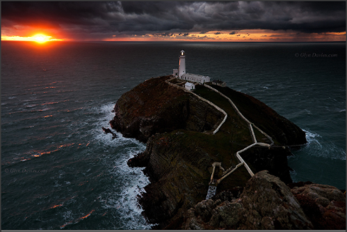
5C's on Glyn Davies "Red flash White flash"
Context;
This dramatic photo was taking by Glyn Davies in Anglesey at south stack which is in an island in Wales. Davies is a professional, current photographer meaning that this photo is current to. On his website a part of his portfolio, is landscapes were he took pictures of his experience in Anglesey.
This dramatic photo was taking by Glyn Davies in Anglesey at south stack which is in an island in Wales. Davies is a professional, current photographer meaning that this photo is current to. On his website a part of his portfolio, is landscapes were he took pictures of his experience in Anglesey.
Content;
I think the most apparent aspect in this photo is the sun. The eye wonders of into the top left corner of the image because it's the only illumination created - everything else is dull, but dull in a very daunting way. There's almost a black colour on top of the image so when you see the slightest amount of light, it makes everything else look haunted. The lighthouse is also a main feature within this shot and as said by Davies himself, it was "the haunted lighthouse". It's positioned on the right hand side of the image but also to the middle making it the main epitome of the image. It definitely gives of an eerie feeling when looking at it because the colours are just so dim, almost hellish because - even in the sky - you see orange and black with quite scary looking spirals of clouds. The picture is surrounded by the sea with little segments of highlights from the sun which gives off the illusion of the sea being on fire.
Composition;
The composition is very detailed and elaborate. There isn't any direction that you think is the main aspect because, first, you would think Davies wants to portray a more drastic emphasis to the sun, but then you look at the lighthouse, and you think that he wants to give a traumatizing feeling to it, and then you look to the sky and you feel you are in an outlandish atmosphere, so there's really no direction specifically. However, the organisation is almost as if at the front, there's something petrifying going on, something scary or mythical and then as you look back you see slight hope, a little light were it might have picturesque views.
Connection;
Looking at Davies' photo of his visions on the lighthouse, I really want mine to give of a slight impression, weather it be enjoyment or anguish. I want, not just the lighthouse, but as many images to give of a certain feeling to whoever might come across the picture. I will take pictures of different elements of the surroundings and try to understand the fact that I need to create an emotion within the picture.
Comment;
Overall, the picture is very dramatic, you get the overview of something perplexing going on. I appreciate the way Davies has used his sense of colour and camera to capture such a sinister scene. The panoramic view is excellent but, I wonder what it would have looked like if he had picked a specific part to zoom in on.
Chosen Photographer; Cheryl Hamer

Context;
This photo is taken by Cheryl Hamer who is a landscape photographer, she has been to many places therefore she has knowledge, manipulation and extraordinary photos, based on landscape. She worked across the whole of Anglesey trying to grasp the suns light, tide positions and spent a year to capture the different dynamics, which are on her website (link above).
Content;
In the photo that I've chosen, I feel Hamer really wanted to explore her colours and take advantage of the summer weather and atmosphere. Her photo consists of grass, land, sea, sky and hills which you would normally get on different locations however, she's taken it in a way were all these are combined which just adds a unique touch to the picture.
Composition;
I can really capture that Hamer strives for colour and composition. I'm personally attracted to how she's framed her photo in terms of having the sandy grass either side of the photo, and then right in the middle you get a beautiful, tranquil, panoramic view. The lighting has probably been adjusted to get more vibrancy - you get an alluring contrast with the greens and sandy colours which then fade out into baby blues; it's almost a mist/fog. The misty grey, blue sky at the top and the sun glow sand at the bottom really emphasise the contrast Hamer wanted - this is exactly what drifted my eyes, both, to the foreground and background; the background makes me wonder what's beyond the hills (it's the drifting point) but we can only see the hills making up the horizon. I assume she's probably had to sit down or crouch in order to get the amount of grass she needed, but also to get the sea and hills. Nothing is milky or intricate so I believe she's put the shutter quite high to capture the movement of the grass and to also include the sharpness - we can see each grass line clearly as well as far into the distance. With that being said, she might not have needed to use a tripod but she might've wanted to in order to gain more of a crisp shot.
Connection;
We are going to be going to Anglesey as part of our landscape project, and this photo has given me the urge to capture different types of view (worms' eye view, birds' eye view etc). I want to be able to incorporate the colours, as well as having all these features such as drifting point and sweet spot, which Hamer seems to have in all her photos - they add in more of a dramatic edge to the photos as well as sophistication. Hamer really took on her landscape opportunity by trying to grasp, not only the sea and sand, but everything else at the present location. This is what I want to be able to do because, I want to a have the rural element of Anglesey really sticking out, not just the typical sand and sea that you're able to vision.
Comment;
Overall, I really do admire what Hamer does with her photos - it's almost as if her photos are animated or drawn because she thoroughly thinks about how to make the photos hers, and I feel she adds manipulation but to the least so that her images have a slight realism to them, but also the professionalism. However, I do feel she could impact the realistic feelings even more towards the photos, because then you can capture movement and life although, that's just her way of taking her photos (as you'll be able to note on her website).
Mind Map

This mind map is specifically tailored to help me take the photos I will need when I reach Anglesey. My main goals are following:
- Sightseeing (so anything that people would see if they are at Anglesey)
- Nature (the environment but also any creatures that may be seen)
- Beaches (different types of sand and view)
- Light (a variety of exposure to evoke different emotions and feelings from pictures
- Texture (this is probably my favourite one as texture can vary depending on where you are and can leave you to think)
Inspired Photographer/Photo Of "Light House";

This photograph is taken by "Drew Buckley photography". It's made me think about how I can go out taking my photos really capturing the surroundings of the main element, but I want to be keeping it very basic and minimal so later on I can take the photos into photo shop, were I can add a lot more such as; colour, definition and depth.
My Photos Of "Light House";


Best Photo;
This is the best photo I took of the light house because, it wasn't washed out, the composition was accurate, in terms of how you can see the ocean and then at the front you can see a light house on the hill - it looked very beautiful. Nothing was out of place or blurry and therefore, it gave me the simplicity that I needed for this photo so that I can later on take it to photo shop.
|
Worst Photo;
This photo, turned out very unexpected because, it was blurry at the front and initially, I wanted to make the background the main focus but as a whole, it came out really unprofessional. I also think the photo came out a little washed out and therefore, it didn't give of the impact I thought it would however, I'm not totally disappointed at it because, the positioning is something that gives it its perplexing overview.
|
Inspired Photographer/Photo Of "Trees"
This photo, by David Lindo, links in with my theme of the trees. He's a photographer who likes to look at wildlife but, this one that he took, in Anglesey, gave me the idea to go to Anglesey and get some great composition of trees. I knew that I could experiment with the light and rule of thirds with the trees; as shown in my tree gallery.
My Photos Of "Trees";


Best One;
This was my best photo given that the two trees at the front made the picture look symmetrical, but I also like how alluring it looks in terms of how the sun's light is hitting a specific part of the land which then gives a contrast to the other side of the image, making it darker. For me, it looks very mystical, I want to go further into the picture to see what's beyond the trees. It related to my chosen photographer in terms of capturing the trees at a forward angle.
|
Worst One;
Looking at this, it's quite obvious that this picture is not the best one given that it came out blurry and not polished although, the composition and placement is very good. It's not as illuminated as Lindos' and I feel as though it needed more dimension to it.
|
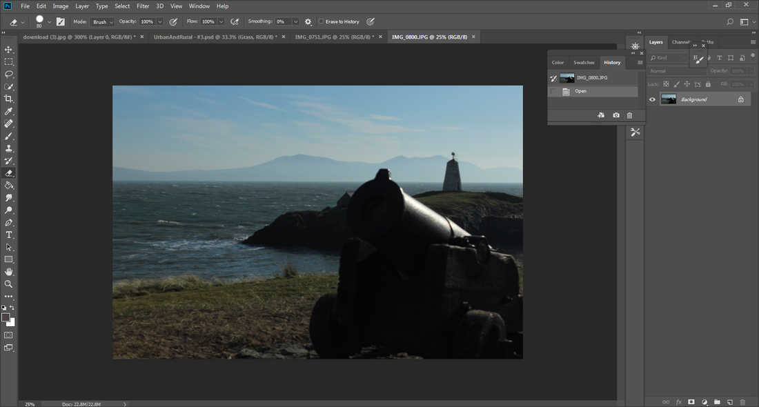
Inspired Photographer/Photo On "Rocks And Pebbles"
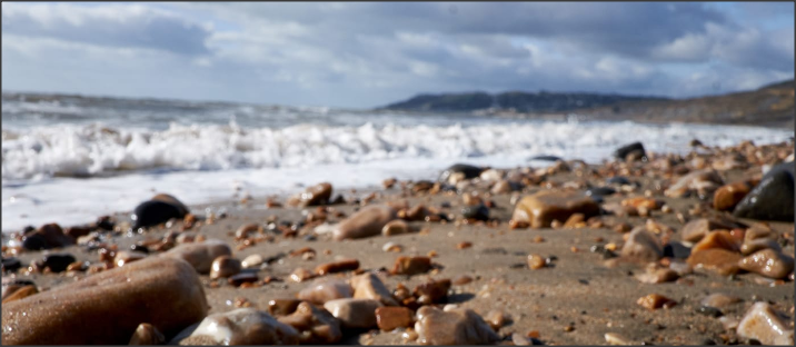
This photo was taken by the "Jurassic Coast Trust" who specialize in fossils - they went to Charmouth Beach to capture this. It really highlighted to me to take different angles and points of views because you get a different image as opposed to doing a birds' eye view to visualize the colours of the rocks (as what I've seen prevalent on researched images). Not only do you grasp the variation of rocks, but also the environment and weather.
My Photos Of "Rocks and Pebbles";


Best One; |
Worst One; |
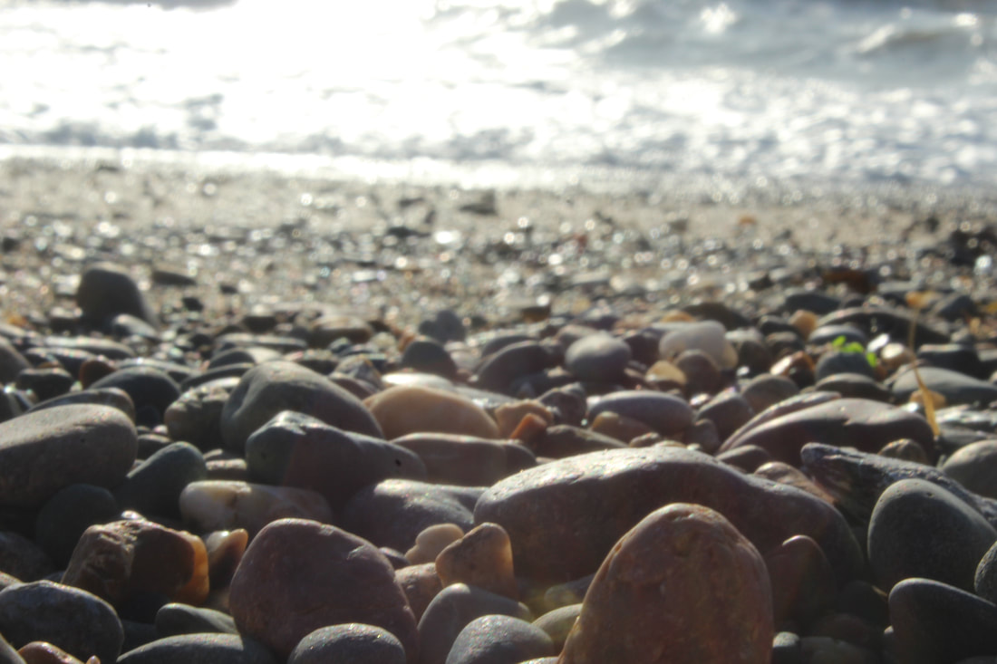
This photo relates massively to my inspired photograph and even though I had a lot of "best ones" for rocks and pebbles, I was really pleased at how this picture had turned out because, I had managed to not only get the colour of the rocks and pebbles, but the blur in the middle ground of the photo, as well as the shine (acting kind of like a sweet spot). To me, it looks like a crystal clear image fading out and blurring itself rather than having it easy to see. It just adds a more professional look.
|
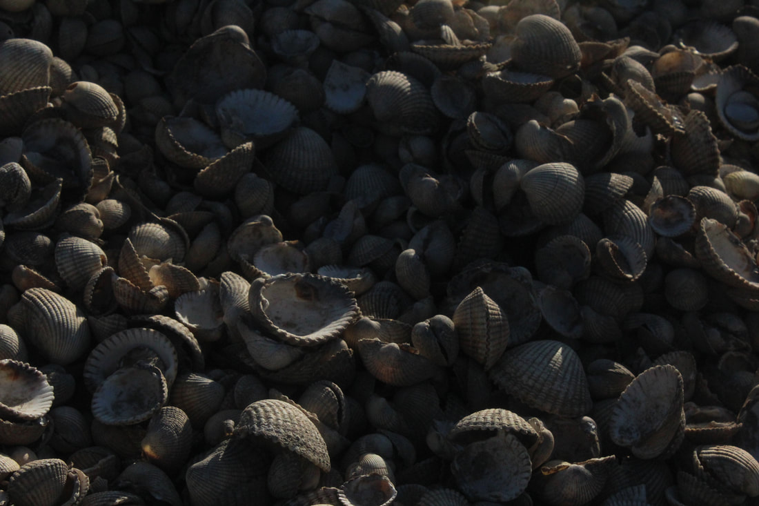
I had mixed feelings towards this picture because, even though this picture has elements of dramatic light and similarity in shells, it was just to very boring and generic - it had no particular direction and thinking even further about it, I didn't know how I was going to be able to manipulate it.
|
My Inspired Photographer/Photo Of "Seaweed";
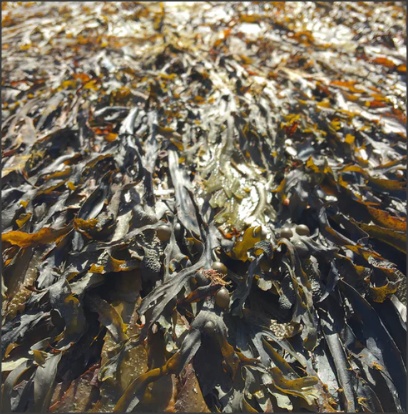
Seaweed is something that anyone can bypass purely because it's something you can include when taking seascapes however, I think it will be a great opportunity to zoom into them and capture the texture. Texture is something I was really keeping an eye on in my research because, you can really zoom in on the detail to capture a specific object; the different colors of greens are definitely prevalent, and this is what I want my "texture" to exhibit in. I want people to look at my seaweed images (or anything relating to texture) and say, "This is something different".
My Photos Of "Seaweed";


Best One; |
Worst One; |

I love the way this turned out because you can definitely see the variation of green (in the light and dark lighting) but then there's a colour contrast of white (form the rock) it becomes a sweet spot and adds a different view as opposed to just seaweed.
|

This wasn't bad at all however, it diminished all of my wants and needs - the colour pop of green wasn't prevalent and I feel it was to dark to be seen. Although, looking at it from a different perspective, it's quite moody and could fit into different types of categories.
|
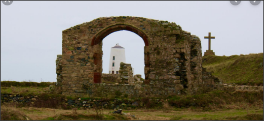
My Inspired Photographer/Photo Of "Lighthouse And Cross"
This photo is taken from "Celticos", they have a website all to do with Anglesey tours and this was their picture. Not only did it evoke the rural side to landscapes, but it also has something different to have variation in it. There was framing and nice colour pops which just opened by eyes to look for different things and not the typical aspects.
My Photos Of "Lighthouse and cross"


Best One;
This turned out to be the best photo because, even though it was dark I was really fond of the way it looked. It gives an eerie element but also the rural side to it. I noticed that the most amazing things about this photo, was the textures, colour contrast, sweet spot, background/middle ground/foreground.
|
Worst One;
This was far to washed out for my liking - the streaks in the sky weren't noticeable and the objects that I needed in this photo (to add something to the rural area) were to foggy.
|
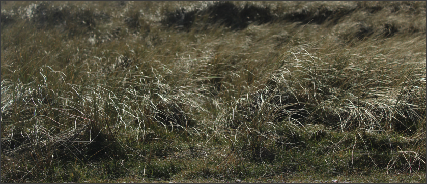
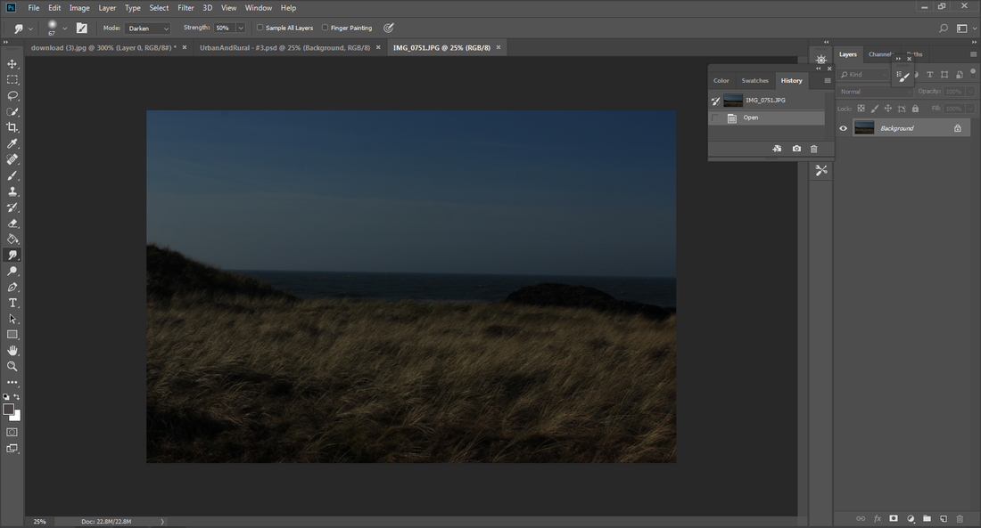
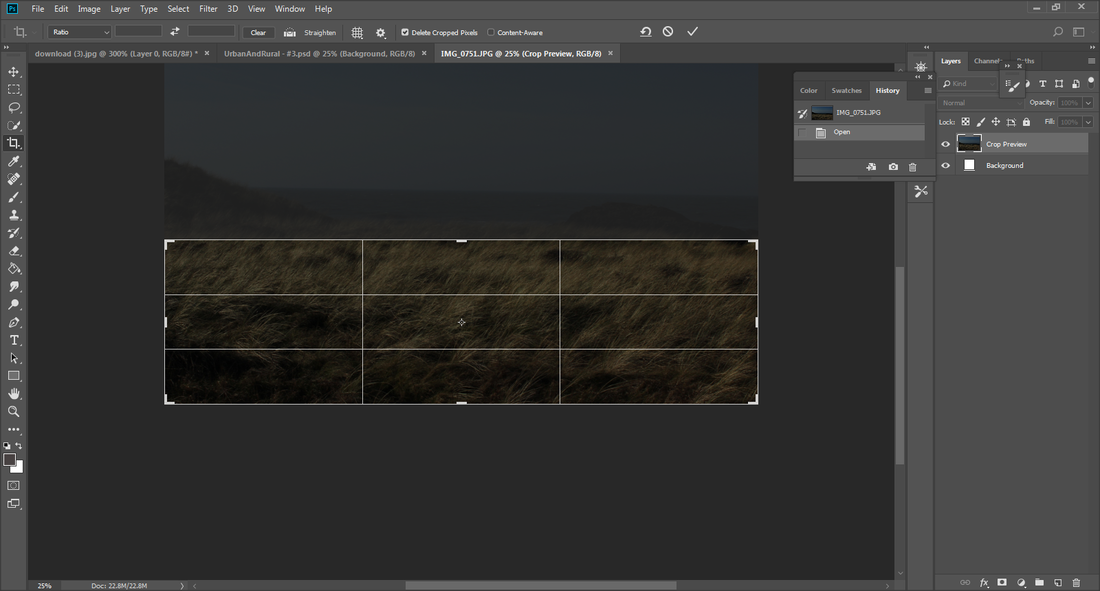
My Inspired Photographer/Photo Of "Grass"

This photo was taken on a website called "FLORATUBE". As simple as it looks, it was something I wanted to add into my grass photos, later for manipulation, but also because the background is blurred and it does give a tranquil feeling - this is something I want to add into my photo.
My Photos Of "Grass"


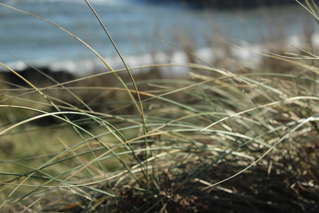


Best One;
I love the way this photo looks because the grass is different shades and then in the middle ground you're given a brown version of the grass. But what makes it look really pretty is the blue sea behind as it's not just grass on its own its got a different element to it.
|
Worst One;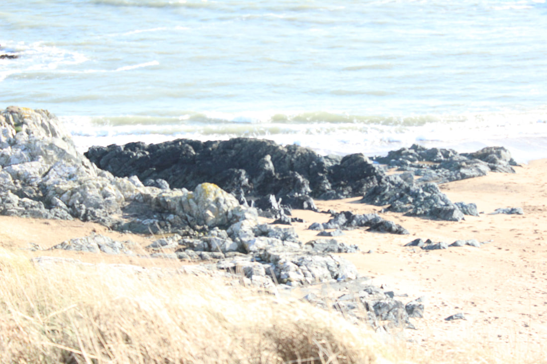
This is far to washed out, definitely doesn't fit any needs and wants; it's to overexposed causing a lack of clarity in standing out, the sweet post and just in general, what the picture is supposed to portray.
|
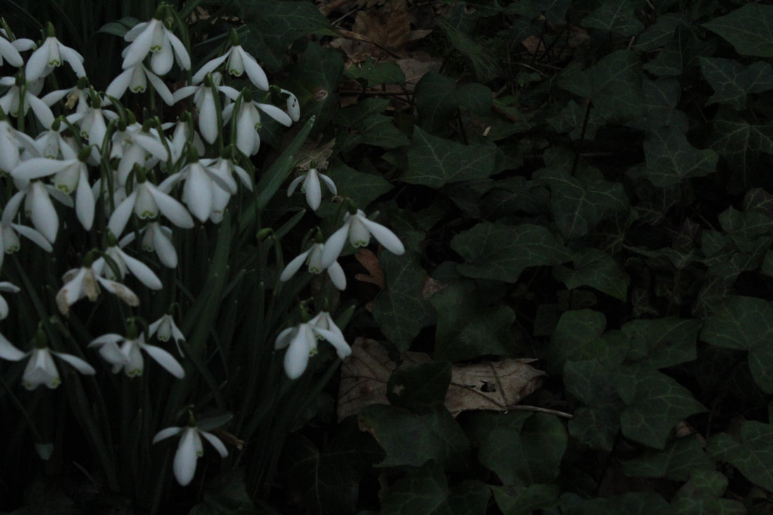
My Inspired Photographer/Photo On "Flowers"
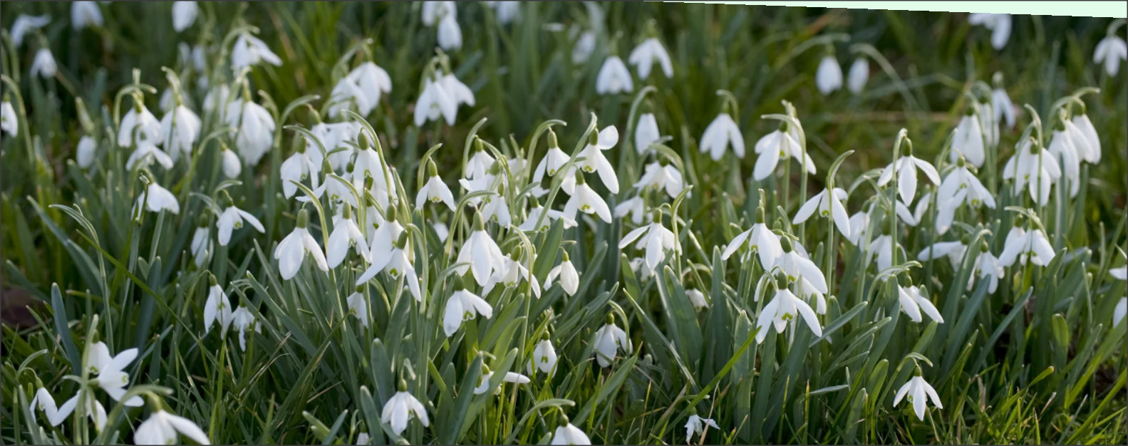
This photo was on a website called "nationaltrust.org.uk". The snowdrops appear February time which is the time we went to Anglesey so, we were very fortunate to have them there. They look really beautiful on there own as well as a potential manipulation to collage them.
My Photos On Flowers;


Best One; |
Worst One; |

|
|
|
This was the best one for me because, even though it was not correct, in terms of white balance, everything else looked very pure and elegant. The background was blurred so what should be the initial spot (snowdrops) is standing out.
|
I wasn't particularly fond of the way this picture came out because, I just didn't like the composition, it looked very tacky to me. Even though the colour contrast of green and white was there, it didn't really have much direction.
|
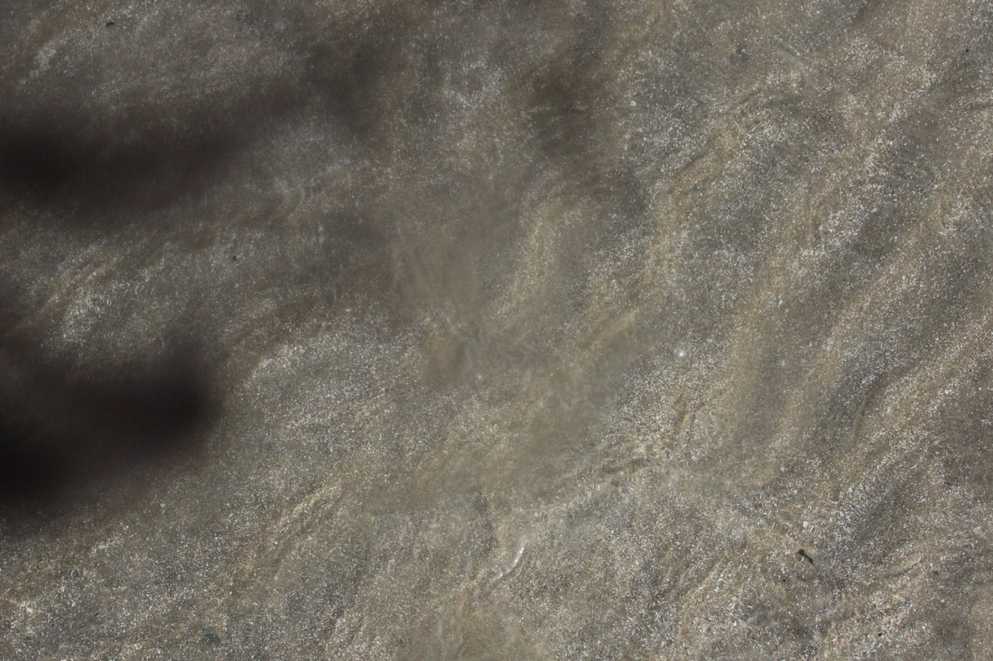
My Chosen Photographer/Photo On "Texture"

This photo is what I chose for my texture from "freestocktexures.com". What came to my mind instantly, was the idea of this being chocolate but, it's actually dried, cracked soil; that's the most amazing thing about texture because, it looks like something else and/or you can get the whole concept of where you at (urban/rural).
My Photos On Textures


Best one |
Worst one |

Different elements of colours and objects add to the texture; there's the green seaweed which is the complete opposite to the red rocks. It makes you wonder a little bit about where the photo is taken for example, the floor or on a rock etc - that's what I adore about this photo; the colour, the thought and the zooming in.
|
This wasn't a bad photo at all but the fact that it had no particular texture made it the worst one out of the many I took. It relates more so to shadows but I do love the ambiguity within this photo as it questions the viewer as to what could've caused the shadow on the sand.
|
My chosen Photographer/Photo On Water Splashes

I was inspired by this photo black and white water splash photo by Tony Hertz because it looked very pretty and time consuming however, all that has been done is putting the camera on a high shutter speed. From this, I wanted to form my own water splashes because, they would add dimensions to what ever I photo shopped it into.
My Photos On Water Splashes


Best One
|
Worst One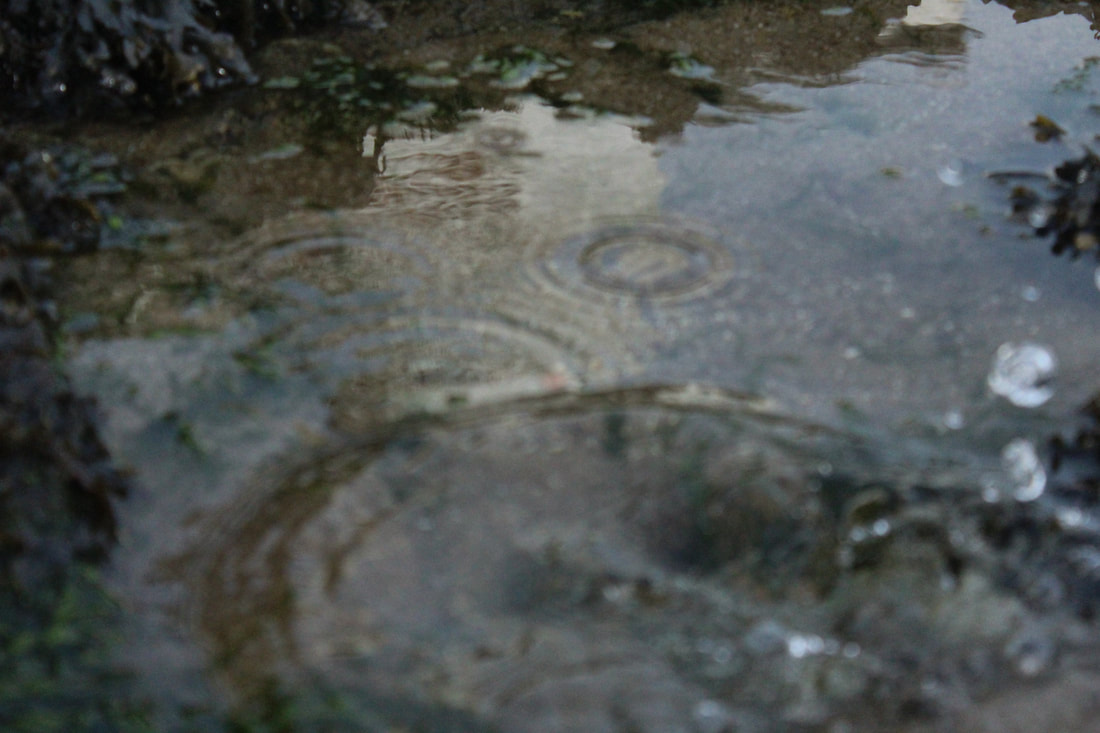
|
|
The water splash that was formed from using a rock had almost made this water ball shape in the little pool. I had my shutter on a very high speed in order to capture the water.
|
It was very blurry and it didn't have the exact type of water splash I needed
|
My chosen Photographer/Photo On Sea and land

This is a picture taken at Anglesey were Karen Burns-Booth was privileged to have gone to a salt tasting test. In terms of photography, it evoked a great sense of lighting and a very illuminating panoramic view.
My Photos On Sea And Land;


Best One |
Worst One |

This is my best photo because it links to my initial research (the Cheryl Hamer one). It incorporates everything of landscapes in one - which was exactly how Hamer's photo was perceived to me.
|

This picture is very vague, there's really no special element to it, it looks like a generic photo which you would take on your phone. Blurry is how it comes across
|
Linking My Inspiration;

|

|
Linking Paragraph
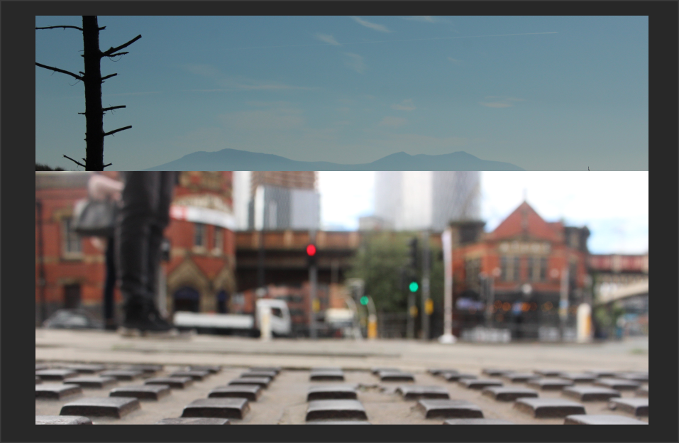
As part of our portfolio we had to take contrasting images, so pictures of rural landscapes and pictures of urban landscapes. For this we went to Anglesey (rural) and Manchester/Salford (urban).
The overall glance from my work definitely shows variation between textures, sky and much more. The weather is a huge segment of this because, in Anglesey the weather was mostly a greyish, dull colour (winter) even thought hints of suns rays was formed, were as the weather in Manchester/Salford, was much more illuminated and warm (summer).
Landscapes seemed like it would be a breeze to take although, getting to actually take the photos (from both urban and rural) I found that I had to take photos that really evoked the difference of both landscapes - there was a lot more to take then I had thought for example, close ups, panoramic views, textures, waves, people, trees, floor, dirt, sky and anything else that would strongly relate to urban and strongly relate to rural.
The differences are easily noticeable because the Anglesey pictures are leaning more towards the beach and winter climates, whereas the Manchester and Salford pictures are a walk about in both cities, were you can really capture the cars, construction and a more busy vibe.
I thoroughly enjoyed going to Anglesey partially because I hadn't been to that Island before - it was new to my eyes and therefore, I wanted to capture everything. I also enjoyed how different it was compared to just being in an urban area; a lot of great pictures were captured and looking back at them, they look really admirable.
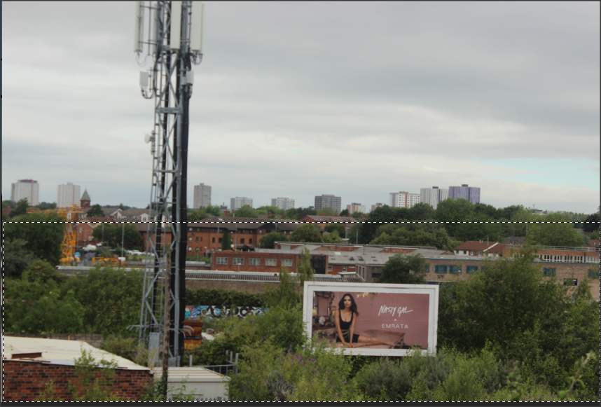
Urban - Manchester/Salford
The 5C's on Paul Grogan

Context
This photo was taken by Paul Grogan. He is a landscape photographer from Manchester; he has seen it evolve and grow over the past 20 years so has a special eye on where to go and what to take. Not all his photos are like this however, he wanted to incorporate a gritty black and white colour theme.
Content
In the photo you see an immense clock, it's the Manchester town hall. Given that it was already meant to have a Gothic look, when it was made in 1877, just adds with the colouring Grogan has chosen. You definitely get this urbanised feeling however, even though its taken from recent times, I felt it was eerie looking at it, not only because it had Gothic elements to it, but also because it looked very vintage and mythology like.
Composition
I think the main reason you feel a sense of eeriness is because of the way the camera is positioned, it's looking up to the buildings and therefore, gives this illusion of us being microscopic and the building having some sort of power. Instantly, we notice that the town hall is placed on the right of the photo and there's something else on the left of it; it adds to the dramatic aspect, as opposed to just having one of the buildings prevalent. I would have to say that the sweet spot is the town hall clock as it's something my eyes are quickly drawn to. Positioned as a higher building then the other, is what drives my eyes to it as the rest of the things below, sort of look up.
Connection
Looking at this photo, it's given me a few ideas I could use for when I go to manipulating my Manchester/Salford photos. It doesn't necessarily have to be positioned that way or changed into black and white however, what I've gathered from it, is I can contribute to what my pictures and the location has given me; it just enhances the photo because the Gothic overview of the town hall is enhanced even further by adding the colours black and white as opposed to it just being in its normal colour.
Comment
I love the way Grogan has used photo shop, not to do drastic changes, but to just develop the pictures with small changes - it can really impact a photo on another level. I also appreciate how Grogan always thinks about his composition throughout his photography because, it impacts whoever will be looking at them.
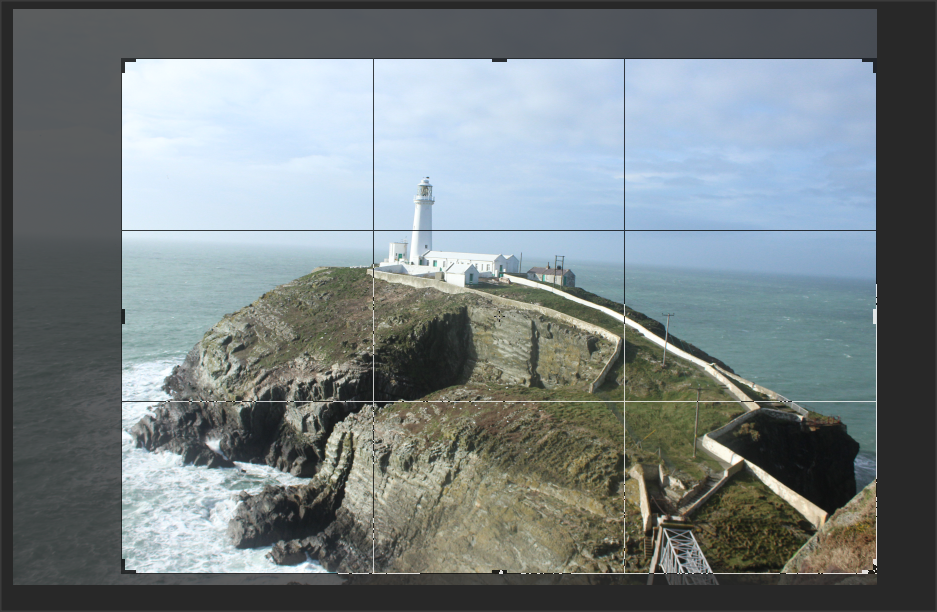
My Chosen Photographer/Photo On Panoramic Skyline;
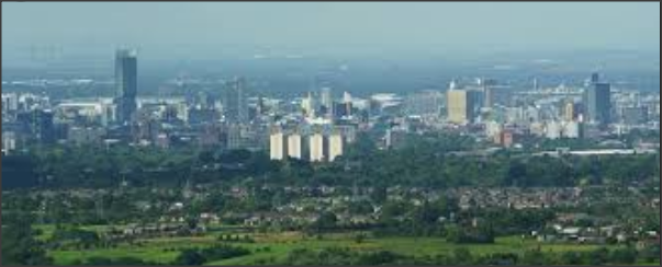
This photo didn't have any information about it but, I thought something as simple as this could be something huge once coming to the stage of manipulation.
My Photos On Panoramic Skyline;


Best One;
This is my best photo because it copies the photo that inspired me in terms of it just being a plain photo. Again, it's something simplistic to later edit in photo shop.
|
Worst One;
|
Textures


Hilton Hotel


Worms' eye view


Sky


Close ups


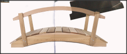
Bridges/Arches


Reflections


Water


Buildings


Birds' eye view


Misc Photos


Manipulation
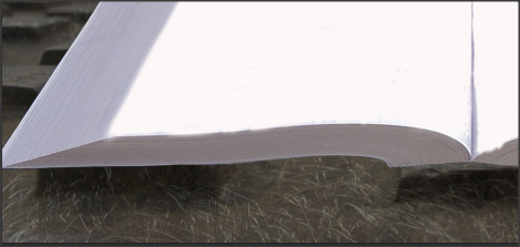
My Chosen Theme;
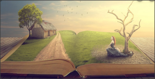
Already looking at this illuminating picture, it evokes something new and unique. I adore the way that this picture is 'weird and wonderful'. This isn't the topic we are doing however, I've taken the book idea and I will incorporate it with the landscape aspect because, there's so many hidden messages the book could imply. I'm planning on having it so that one side will be urban and the other side will be rural. If everything goes to plan, this could be something very beautiful.

I watched the tutorial https://www.youtube.com/watch?v=R2kpXHrgCXw on the exact picture. It's by rafy A who is very intricate in his photo shop as shown in his Instagram, as well as the very attractive picture from above.
Experimenting


|
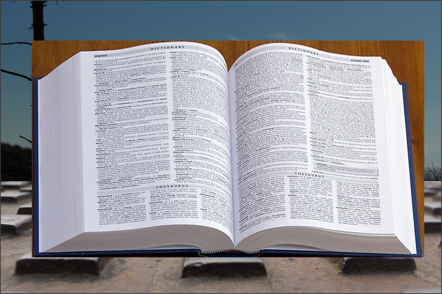
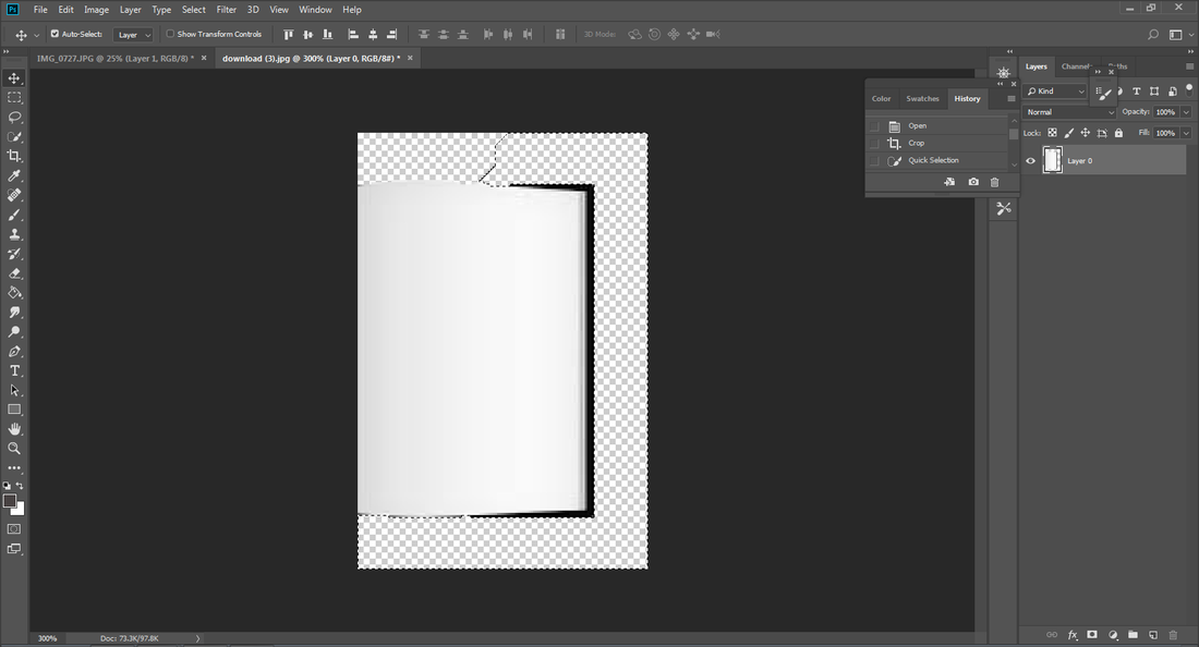
The main element of this project is the book. I got this one "labelled for reuse" of the internet were I will crop of the background and resort and change the perspective of the book. Initially, I wanted it open directly in front of the audience, but I can still work from it. In the actual photo shop process, I will do a separate photo shoot of a book which can fit my needs.
I need something in the background for the book so I will use a urban picture and a rural picture. This will be on the bottom half of the back ground and the tree with the sea (rural picture) will be the top half of the background. |


|
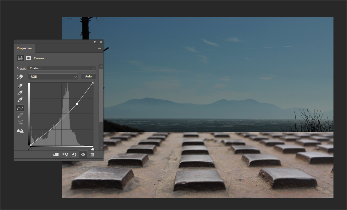
The very first thing I wanted was an urban and rural background to grasp the contrast of both areas, to do this I needed both pictures together
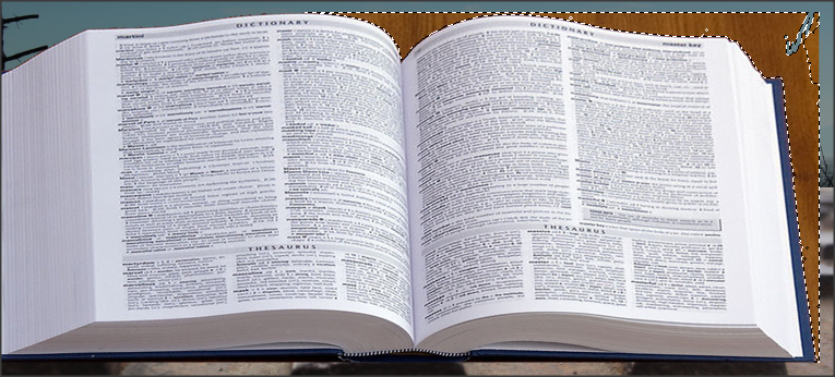
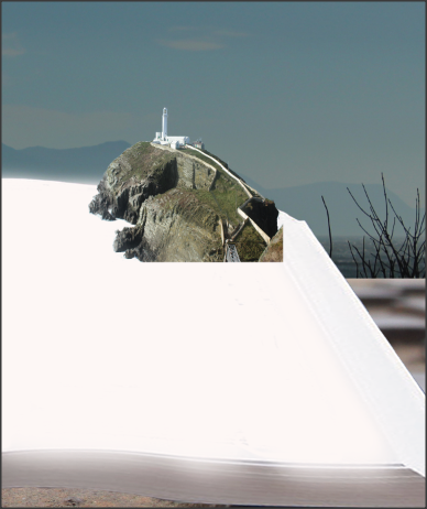
I cropped the the urban picture so that the floor was only noticable I changed the layout in terms of what I needed more of I changed the brightness because both images were taken in different lighting therefore resulting in different exposure so, I adjusted the brightness. And by using the curves, I tried to make the pictures similar in colour. I wasn't to fussed about it because, I was trying to deliver a contrast so the lighting didn't bother me that much but, I didn't want anything looking too abnormal. I used the perspective tool so that the book will physically have the assets that I need on it properly. It was also going to help me with editing out the background, of this book, more quicker. Because the book was on it's own layer, I had to copy and paste it onto the layer I needed it on, before I could proceed with the rest of the things I need to do. I had to deselect the layer I needed in order to make it so the book was on it's own. I had white and the paint brush in order to cover up the words, it didn't look to realistic at that present moment, but once everything was finished, I would see then what background to use and what needs to be softened The most important aspect of this photo shop idea, was to add on the main parts that make up the urban and rural so, I first decided to use this lighthouse. Using the eraser, I cleared the background to have the lighthouse on its own. I started adding objects in seeing what fit where and what would look best. I then thought it would be a good idea to get an urban background and crop it. I brought it onto the layer I needed it on and changed the opacity so that the 2 urban and rural meshed in together. I did the same for the bottom half of the picture and meshed the grass with the urban floor. I needed to go back in and change the contrast and brightness so that the detail could be amplified after once I had changed the opacity. I added in a bridge to add this element of walking across the pages. |


Final Outcome

Seeing my finalised product, I feel as though it took more of a random turn, which I don't mind however, it was very time consuming therefore, I chose to not make my own shoot of the book this way or to replicate the same layout of this book. It was very hard to bring my assets to life (when standing them on the book). I had to use a range of tools. This meant I was introduced to the free transform tool; an example of this was when the brick floor was moved in order to tailor the book shape. I think the tool that brought this whole outcome together, was the perspective tool (to alter the books position slightly). I had to use the eraser tool a lot to delete the background for some assets and to sharpen things up a little. Overall, I'm not disappointed in the way this turned out although, I will do something a little more realistic as this took a very whimsical approach.
Second Manipulation

I went for a different book layout to mimic this idea of somebody in a cafe who has probably left the book open. From this, various things will come out from the book as opposed to having them on the book. I got this from the internet (free for use).

I combined both of these images together.

|
Then used the eraser tool to get rid of the white background from the book.
|

|

|
I then needed a picture to place inside the book page however, I didn't want anything random, I wanted it to specifically contrast with the urban setting so I deliberately picked a dark, moody photo.
|

|

|
I needed to start adding more to the rural element of this project so I used this picture.
|

|

I then flipped the hills and layered it behind the book.

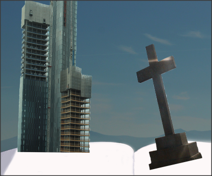
I then thought to add a cross to the book because, the book has a moody dark element and this cross will amplify that.

|

|

|
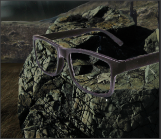
I wanted to include this concept of somebody who's engrossed in this "nature" book so adding this element of glasses really took that on board for me. I cleared the white background and dragged it to the layer I needed it on.
|

|

|
I thought it would give a bigger impact if the glasses were on the rock to really put an emphasis on the rural aspect and as well the urban.
|
|
Final Outcome

Third Manipulation
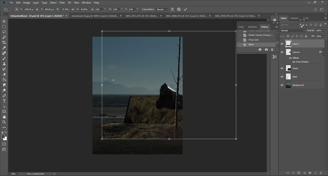
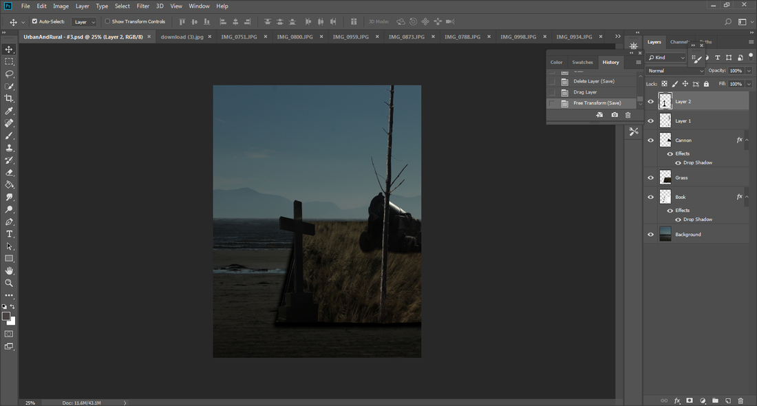
For my third manipulation, I wanted to try again with the open book idea but, instead of editing the background, I thought it would be ideal to keep it realistic because that's what my inspiration was. The main focus was the book and not the background and I think that's what diverted the main aspect of the open book idea and that's why it took more of a whimsical approach.

I used this book template because the black cover of the book would later on help me to form a shadow underneath.

I chose to use this background because it was very simplistic which is something I needed in order to accomplish this outcome.

I thought to make the best of this outcome, it would be beneficial to do one side of the book first and then do the other half afterwards.
|
|

For the ground on the book, I needed to use a grass picture and crop it so that it would look normal when changing the perspective so that it fit the book.
|

|
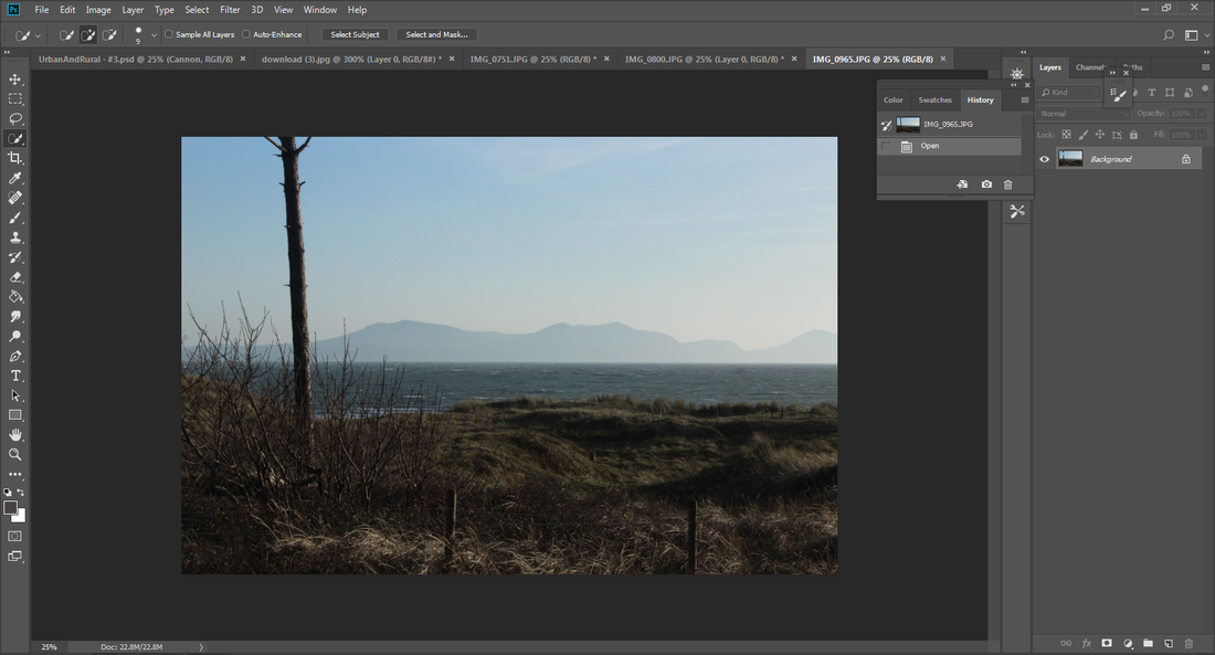
I started to add the fundamental aspects of rural onto the other half of the book. I stated with this cannon picture - I deleted the background so that the cannon was on its own.
|
|

I thought it would make sense to get images that have grass on the because when I crop what I need, it won't look abnormal. So, I go the tree to the picture and added it to my manipulation.

|
|
I decided to add the cross in because it would've given a more dramatic look and the color scheme already matched the cannon and dark feelings.
|

|
I then needed to complete the other half of the book (urban). So I cropped the otherwise of the image I needed as well as the book.

Then I used the brick floor for the urban side of the book.

Then I used the skyline to add in a little bit of a skyline to the urban side of the book.

I thought it would make more sense to have Hilton Hotel on the urban side of the book.

I then positioned it on the book so that the building was properly on the book.

Then I got another building, with a colour contrast to add in a little more contrast to my book because, I felt that there was more blue/grey tones.

Then I deselected the background from the building.

I decided to have the building positioned in the middle of both the sides of the book as it connected the whole project together
Final Outcome

Fourth Manipulation
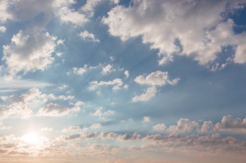
I needed a more simple background that would make the book stand out but ultimately, it needed to evoke a fairy tale element to it. The sky being straight forward with a hint of pink already exemplified the picture I was going for.

I used this book because I needed it to link to the artist research as well as having a border around the book to make it sophisticated.
Final Gallery (10 - 15 images)


Mock Exam - Evaluation
My project theme was an open book which was inspired by a picture on google images by a person called Rafy A. When I finished my urban and rural project I thought it would be a really unique idea to connect them both together having them be on a book so each feature of the landscape is apparent.
At first looks, it seemed liked something amazing and accomplish-able however, when trying to do my first attempt (experiment) I realized that actually, everything needed to be thought about very accurately (in terms of what looked good and were everything could go) because I had been to different locations, on different seasons and days which meant that the pictures would have several exposures. This was the challenging part because everything looked very abstract (as mentioned in my experiment). I didn't want things looking informal however, it turned out to be very ambiguous and I did like the way the outcome turned out, as a first attempt and as a meaning of its own.
The best part of this project was the manipulation given that I was fully able to take the photos that I took from both the urban and rural, and make them into something completely new and when everything was combined together, each outcome had its own aspect about it because they all took various approaches for example, the open book, the book on the side, the background and the meaning behind each outcome.
The main epitome of this project was the book, and I believe getting the book in the picture was a crucial part of the project because it was were the urban and rural images would stand. This is why I tried to do a open and a closed book outcome as well as experimenting with the background. When the book was open, I had to make sure that the book was upfront and was in a good position to place everything I needed on it. Tools I encountered because of this was the perspective wrap and shadow.
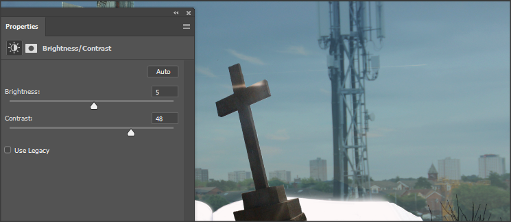
Perspective wrap allowed me to alter the books positioning given that the actual book was on a diagonal, which is not how I wanted it to be - by selecting the book, I was able to move it to the center as well as making it straight. The shadow enhanced the realism of the book as it looked like the light (from the background image) was incorporating on the images therefore, giving the images a shadow. It also made the images pop out more as opposed to literally having them stuck on the book. Other tools I used for the project was the eraser and deselect as they rubbed away anything I didn't need. This was mainly used for the images I was adding on to the book, when I had to delete the background so it was tailored to fit the project image. Deselect allowed me to delete big parts of the image I didn't need and the eraser allowed me to get into the intricate parts of the image as sometimes, the deselect would highlight the parts that I didn't want deleting. Opacity was used sometimes to make the background and image seen at the same time (I used this for my second manipulation). Even though this isn't a tool, I also had to use the layers in order to position some things on top of other things for instance, the glasses on the rock (second manipulation), the tree in front of the cannon (third manipulation) as well as having the book be underneath everything because I was bringing everything from the urban and rural on top of the book. Developing further in my photo shop skills I would like to have the ability to make things blend in a bit more so that it's portrayed as realistic. This is something I am going to have to later look up on a tutorial. Overall, my knowledge for photo shop and the tools has increased drastically, I knew nothing about photo shopping and now I know the key aspects about it: there's still some things I need to know and a lot more that I haven't discovered but I've grasped the main idea of it, and it's clearly conveyed within my outcomes of this project.
Personally, I love my third manipulation because the rural side looks very well blended, this doesn't mean I hate my first one, it just didn't have the outcome I anticipated it to be. The first outcome was just an experiment, it's were I gathered all the images, tried to figure out what looked best and it took a fairy tale turn. As a first attempt at it, I was very pleased by it as it highlighted to me that I had the fundamental aspects for making my second outcome. The second one was supposed to insinuate a person at a cafe (hence the urban background and glasses) reading a book that they had very much delved into (this was the rural aspect). I like this idea a lot because it was the first signs of blending in as well as trying the manipulation with a closed book. When I got to my third manipulation, I came to the conclusion that it wasn't linking as much to my inspiration (when it has a simple background). So, I decided that I should just leave the background in order to have the central focus be the book. After all that's what made my rural and urban project what it was. Initially, it was supposed to be a project of almost a popup book but also to link my urban and rural together. Having them on a book was a very sophisticated idea in my head and then the outcomes showed a new meaning, a varied element which I really adored because it just echoed how high and low I could've gone with this project. Having said that, I hope that the viewers will also find it the same way furthermore, looking at the outcomes, I hope it really makes the viewers appreciate the landscapes and what nature has for you because, on a book (when tried to be realistic) it looks amazing, as it should do in real life.
Overall, I've accumulated an abundance amount of skills from this project as I've had to combine everything into one piece. If I had the chance, I would go back and make the background images simpler so the main focus would be on the book, as well as trying to blend everything in the book well together - other than that, I think it was a very lovely idea to connect both aspects of landscape together and the journey of going through the research, to then taking pictures and finally having a manipulated outcome, highlights how much I've learnt about my camera and my editing.
At first looks, it seemed liked something amazing and accomplish-able however, when trying to do my first attempt (experiment) I realized that actually, everything needed to be thought about very accurately (in terms of what looked good and were everything could go) because I had been to different locations, on different seasons and days which meant that the pictures would have several exposures. This was the challenging part because everything looked very abstract (as mentioned in my experiment). I didn't want things looking informal however, it turned out to be very ambiguous and I did like the way the outcome turned out, as a first attempt and as a meaning of its own.
The best part of this project was the manipulation given that I was fully able to take the photos that I took from both the urban and rural, and make them into something completely new and when everything was combined together, each outcome had its own aspect about it because they all took various approaches for example, the open book, the book on the side, the background and the meaning behind each outcome.
The main epitome of this project was the book, and I believe getting the book in the picture was a crucial part of the project because it was were the urban and rural images would stand. This is why I tried to do a open and a closed book outcome as well as experimenting with the background. When the book was open, I had to make sure that the book was upfront and was in a good position to place everything I needed on it. Tools I encountered because of this was the perspective wrap and shadow.
Perspective wrap allowed me to alter the books positioning given that the actual book was on a diagonal, which is not how I wanted it to be - by selecting the book, I was able to move it to the center as well as making it straight. The shadow enhanced the realism of the book as it looked like the light (from the background image) was incorporating on the images therefore, giving the images a shadow. It also made the images pop out more as opposed to literally having them stuck on the book. Other tools I used for the project was the eraser and deselect as they rubbed away anything I didn't need. This was mainly used for the images I was adding on to the book, when I had to delete the background so it was tailored to fit the project image. Deselect allowed me to delete big parts of the image I didn't need and the eraser allowed me to get into the intricate parts of the image as sometimes, the deselect would highlight the parts that I didn't want deleting. Opacity was used sometimes to make the background and image seen at the same time (I used this for my second manipulation). Even though this isn't a tool, I also had to use the layers in order to position some things on top of other things for instance, the glasses on the rock (second manipulation), the tree in front of the cannon (third manipulation) as well as having the book be underneath everything because I was bringing everything from the urban and rural on top of the book. Developing further in my photo shop skills I would like to have the ability to make things blend in a bit more so that it's portrayed as realistic. This is something I am going to have to later look up on a tutorial. Overall, my knowledge for photo shop and the tools has increased drastically, I knew nothing about photo shopping and now I know the key aspects about it: there's still some things I need to know and a lot more that I haven't discovered but I've grasped the main idea of it, and it's clearly conveyed within my outcomes of this project.
Personally, I love my third manipulation because the rural side looks very well blended, this doesn't mean I hate my first one, it just didn't have the outcome I anticipated it to be. The first outcome was just an experiment, it's were I gathered all the images, tried to figure out what looked best and it took a fairy tale turn. As a first attempt at it, I was very pleased by it as it highlighted to me that I had the fundamental aspects for making my second outcome. The second one was supposed to insinuate a person at a cafe (hence the urban background and glasses) reading a book that they had very much delved into (this was the rural aspect). I like this idea a lot because it was the first signs of blending in as well as trying the manipulation with a closed book. When I got to my third manipulation, I came to the conclusion that it wasn't linking as much to my inspiration (when it has a simple background). So, I decided that I should just leave the background in order to have the central focus be the book. After all that's what made my rural and urban project what it was. Initially, it was supposed to be a project of almost a popup book but also to link my urban and rural together. Having them on a book was a very sophisticated idea in my head and then the outcomes showed a new meaning, a varied element which I really adored because it just echoed how high and low I could've gone with this project. Having said that, I hope that the viewers will also find it the same way furthermore, looking at the outcomes, I hope it really makes the viewers appreciate the landscapes and what nature has for you because, on a book (when tried to be realistic) it looks amazing, as it should do in real life.
Overall, I've accumulated an abundance amount of skills from this project as I've had to combine everything into one piece. If I had the chance, I would go back and make the background images simpler so the main focus would be on the book, as well as trying to blend everything in the book well together - other than that, I think it was a very lovely idea to connect both aspects of landscape together and the journey of going through the research, to then taking pictures and finally having a manipulated outcome, highlights how much I've learnt about my camera and my editing.
